   |
|
|
very
MUCH
still under CONSTRUCTION !!!
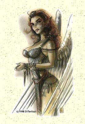
There actually is. It is the place where our little triumvirate lives. Me. Rhiannon. And Jazz. And you, you shouldn't be here. Perhaps it was fate that brought you here. Despair. False hope. A misplaced trust in some power you considered mighty and all powerful. Yet you are here, and whatever you believed, it all does not matter much. You are here. You will probably not leave. Call it fate, if you want. I might call it destiny. Or even dinner. No matter how you try. You can't escape your destiny. You can't avoid being what you are. Cute or ugly. Pretty or smart. Dammit, fool. You should know better. It's this kind of stupidity that has made our life difficult. If you haven't figured it out yet, you can't judge the contents by looking at the cover. You look surprised. Never though that a pretty face could do more than sitting around and dressing up for the occaision. Do I have news for you. I'm a pretty-face-with-brains. I'd rather like to think of myself as some sort of angel. The different sort of angel. I simply don't have the looks to pass for a normal girl, wouldn't you say so? I thought so... The wings are a dead give-away, aren't they? There was a time they were
not an issue. Well, they won't go away, not anymore. I guess I rather have
to live with 'm. It's part of the deal: destiny has its own shape and history
leaves its own marks. Literally.
FALLEN angels, UPLIFTED fiends. (You're kiddin' me, right?) Not exactly. Can't blame you either. You've probably met our sisters, as they roam your worlds. We don't like to talk much about them, but one can't deny her backgrounds... Two of us are fiends, both Alannah and I. Oh, you could call me Rhiannon, if you like. The third member of our little cabal is Jazz. She's a tiefling, one that doesn't talk much. She never talks, actually. I think she can read and write, but I'm not so sure. Not that it matters. She's simply one of us. You are not. It's funny how people react. Some, mostly the clueless (as Jazz would have called them) or the stupid (Alannah's words), mistake me for an angel. Well. I'm not. They expect too much, and I will feel obliged to disappoint them. Then there's the planars (Alannah calls them the real stupid ones). They have seen a thing or two, and have met some of my sisters. They know the things the winged ones can do. The bad ones. I'm not that bad. Look at me. Just a little. See me smile. Just don't hear me cry at night. The clueless are disppointed. The lower planars consider me a traitor and would kill me on sight. The upper planars consider me an abomination, or mistake the present for the past. And then there's not much left, except the gross of the planewalkers that see me as a dangerous fiend. Although I can be evil if I try. Now, you wonder what a dangerous fiend like me is doing on your doorstep, standing in your way... you're worried about your mortal soul, expecting me to seduce you, lure you away. Well... for one thing: get serious. You're not my type. And I've done my time wasting time, got it? Besides... may I point out... weren't you the one that showed up here? Staring at me with your mouth open? Loser. Look, you're drooling. And I'm hungry. I might be reformed, but I'm a succubus after all, and you... you are... Let me call Kylee. Let me call you... Dinner. 
WHY does the LAYOUT look so GaRbLeD? (If only to prove it's neither your eyes nor the beer... or more about... fonts.) It's art, man! (In a hurry? Check the font examples below.) Note that you need a Windows, Linux or Mac to install these fonts. These pages are ancient (and so am I :-)) and were not written with mobile devices in mind. ... well, okay. Perhaps I'm not totally kidding you... I've tried to keep the same style and feeling on some of these pages that you will find in some of the TSR / WOTC products. If the letters above look like a normal font with different sizes and mixed upper / lowercase, then may I suggest to go and google the net and download and install the appropriate fonts. See below how these should look. (Yes. In the past I offered a font pack, but I decided to remove it. Although I got these fonts from a 'public domain' CD rom, they just might be copyrighted... And if they are not you should not have any problems finding them on the Internet :-)) Most of the pages are in 'Arial' / 'Helvetica' (depending on your platform) or 'variable width' (selected in the configuration of your browser). However, there are some fancy fonts... The following six lines show the different fonts... well, they should show the different fonts... You could subsitute other fonts for Arial, Times New Roman, Variable Width and Fixed Width. I would, however, like to suggest to install the second four, Celtic, Bart, Excocet and Caslon Openface so these pages look at their best. For what that's worth... Arial / Helvetica Bold 123 ABC abc !? ... used on most of the archive pages, clear without serifs... Times New Roman Bold 123 ABC abc !? ... used on the Secomber pages... Variable width Bold 123 ABC abc !? ... standard proportional font in your browser, Celestial stuff, may I suggest 'Times New Roman'? Fixed width Bold 123 ABC abc !? ... rough, simple and old fashioned, 'Courier New' would do. Celtic Bold 123 ABC abc ... this font (from the Secomber pages) is rather similar to the one used by TSR in the Forgotten Realms products. Bart Bold 123 ABC abc ... seems to be somewhat related to the publicly despised Comic Sans. Not sure I still use it, to be honest. Excocet Bold ABCT abct ... or something similar, is what TSR seems to use in the PlaneScape setting. Upper and lowercase are identical except for the 'T'. Caslon OPenFace Bold 123 ABC abc ... is used on the Savage Coast page, a high thinlined 'half hollow' font, close to the one used in the Red Steel box. SO how should they LOOK, hmmm? (You can tell me what you want, but I need proof! Okay?) The following table shows how the different fonts look on your machine (upper line, text) and mine (lower line, bitmap). Remember you can change the font size in your browser: in NetScape: ctrl + [ or ], in Explorer: use the font button. The term 'bold' does not refer to the name of the font, but shows you the font in bold. (Yes. People did ask that question.)
Missing those fonts? Google and install... |
|
|